Sugarbee Creative Branding
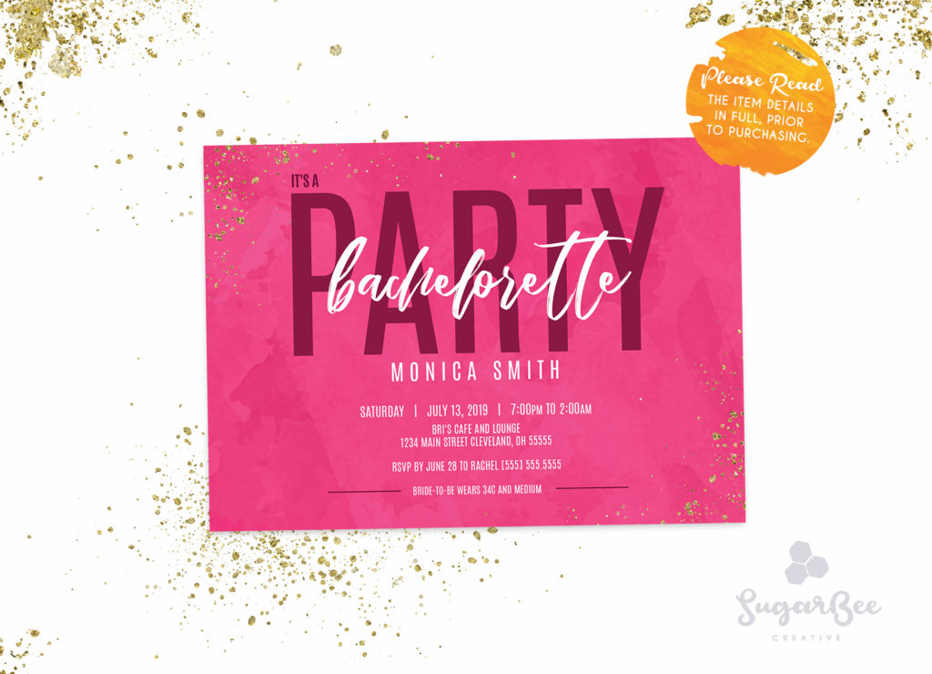
Sugarbee Creative is an online Etsy shop that has sold invitations for various occasions. Below shows my process from concept to creation of the Sugarbee Creative Branding.
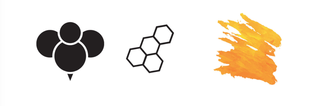
When I began creating concepts, I quickly drew out simple ideas that I possibly could play off of going from a more literal approach to something more subtle. The bee, honeycombs, and a watercolor brush representing honey.
From here I starting testing different fonts that I felt would help bring the brand to life. Since the brand would be selling invitations for special occasions, I knew that I wanted Sugarbee Creative to playful, cute and approachable.
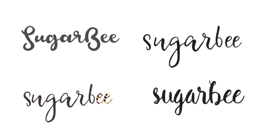
After playing with a few font options I tested out color combinations and font weights, then soon after I felt that the font that I was mainly working with was a bit too whimsical and I wanted it to carry a bit more weight.
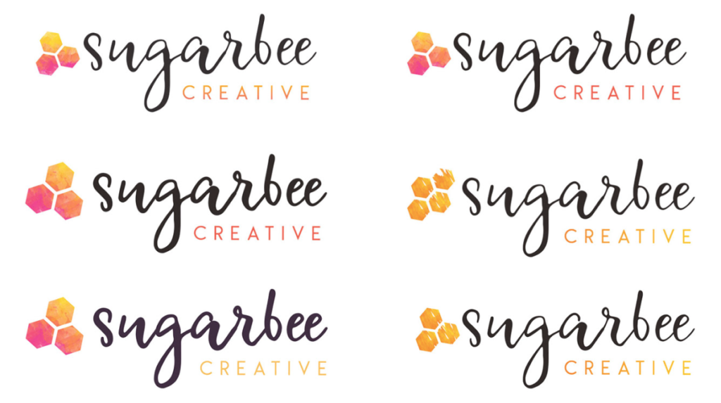
Soon after I felt that the font that I was playing with was a bit too whimsical and I wanted it to carry a bit more weight. I settled on a thicker Script font with a light sans script and then decided to play a bit more with bright/warm colors to help bring the playful aspect to it.
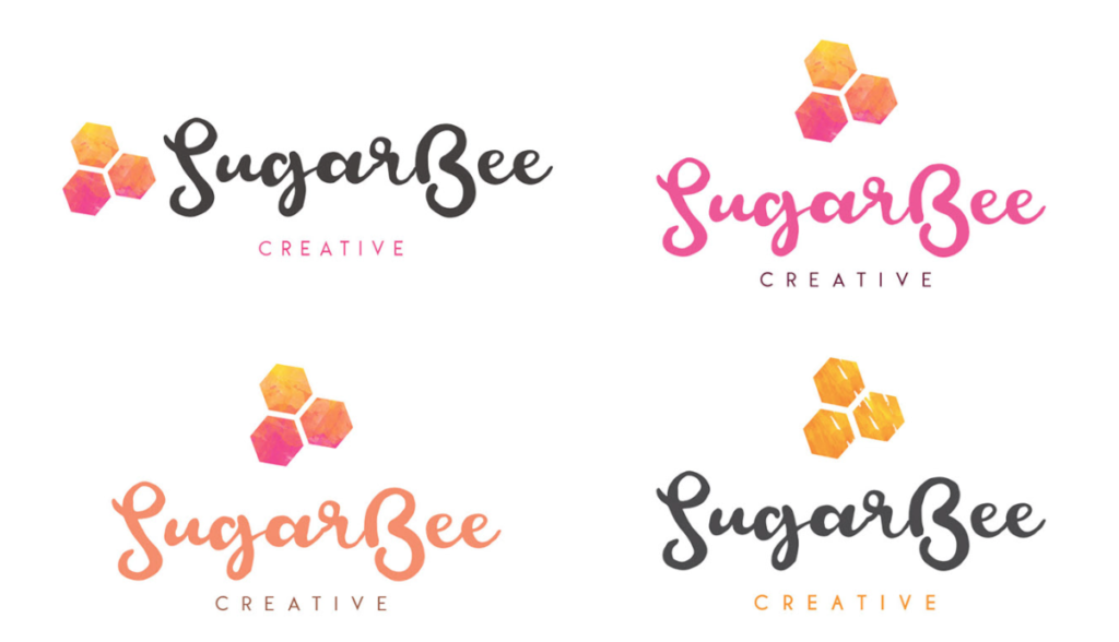
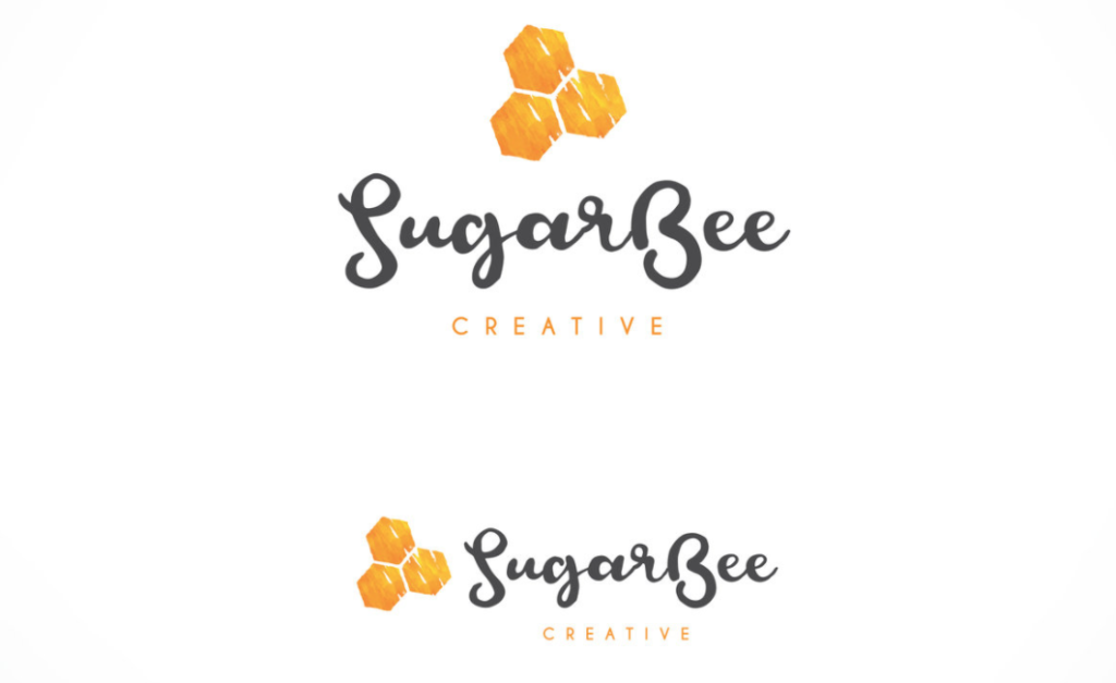
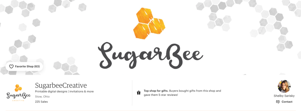
In the end, I decided to go with the less colorful version as the font choice was playful enough. I settled on two versions for different use cases depending on where the logo was being used. A logo animation was also created for future use case.
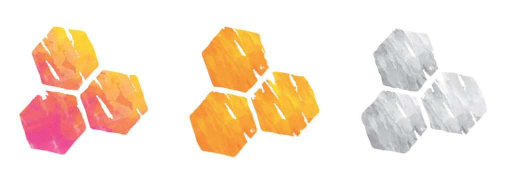
After the final logo was chosen, accent elements were created in yellow and orange, pink, orange and yellow and grayscale to help bring more of a focus to the logo.
Miscellaneous Logo Designs